Lightroom Presets vs. Color Profiles
Lightroom presets are one of the most ubiquitous editing products in the photography world, but they have an unfortunate tendency to work about 20% of the time.
They're built on top of images created with a…
Different camera
Different sensor
Different lens
On a different day
With different light and conditions
And most importantly, by a different photographer who has their own unique approach to what, where, and how they photograph. Trying to "pass" a look from one photographer to another is just not easy to do well.
Good color grading is just too specific and hands-on.
A Note About the People Selling You Presets
Presets are a great way to support your favorite photographers or learn about how they process images, and it's not their fault that everyone's images are vastly different.
There are just too many variables for anyone’s presets to be a great fit for everyone.
This article is not a criticism of people selling presets. It's an alternative approach to "sharing" looks & color grading tools with other photographers that works a LOT better.
Here's why I stopped relying on Lightroom presets and started focusing on creating & sharing color profiles instead:
What Is a Lightroom Color Profile?
A color profile is an .xmp file, very similar to a LUT for video footage, that fundamentally changes how Lightroom interprets the colors your camera sensor captured before you begin making adjustments in Lightroom.
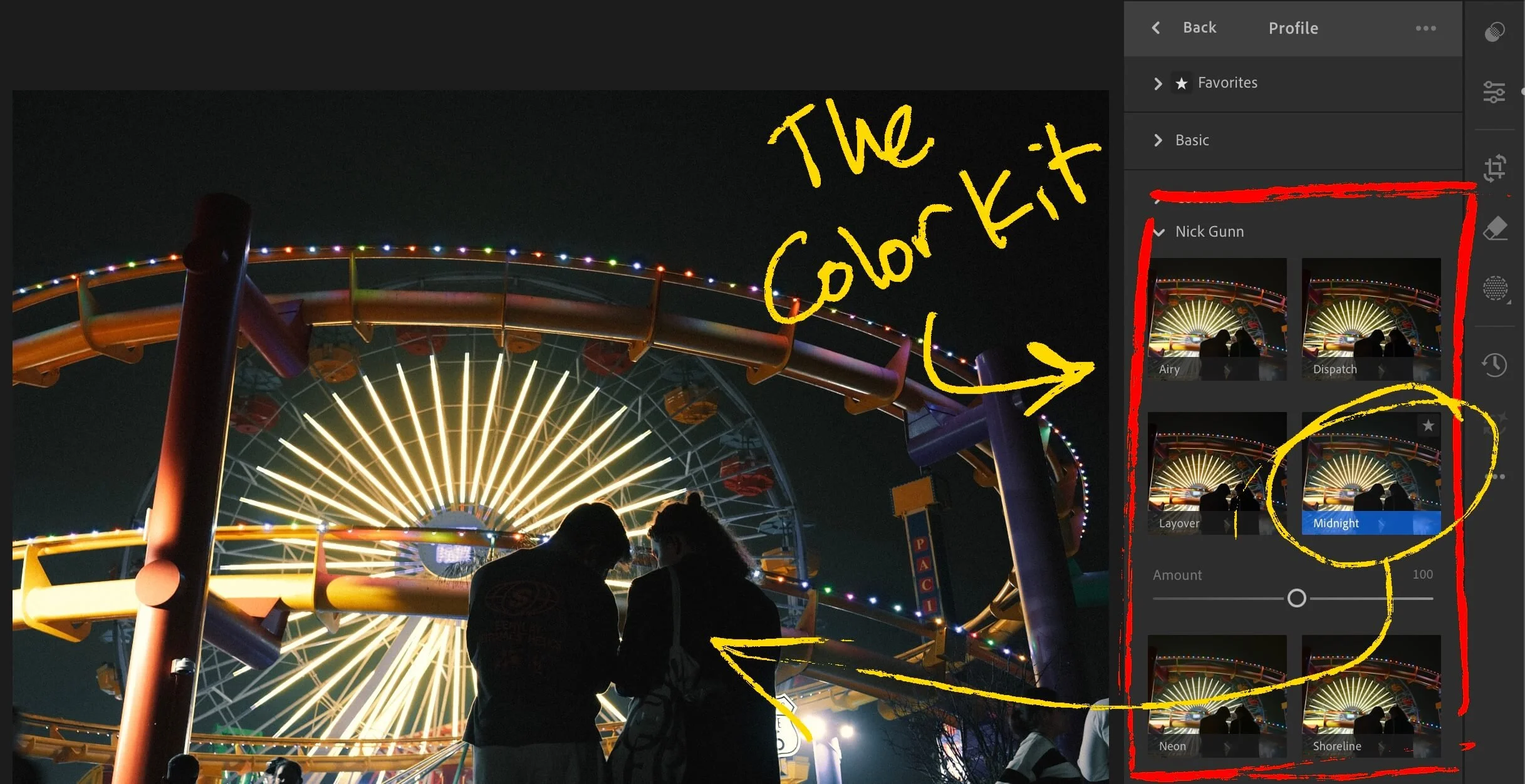
Color Profiles in Lightroom featuring The Color Kit
Instead of simply setting sliders to different values within the boundaries that Lightroom has established, a color profile has its hands on the raw color data from the very beginning.
Think of it this way: a preset is paint on a wall. A color profile is the primer underneath. It changes the foundation that everything else is built on.
Why Are Color Profiles Better Than Lightroom Presets?
Color profiles can adapt to a much wider range of conditions in a way presets simply can't.
Profiles can also effectively expand the functional range of Lightroom's existing controls. A standard Lightroom slider might move a value from 0 to 100. A color profile working in tandem with that slider can introduce a level of specificity that multiplies the useful range of that same adjustment.
The software in which I have been building color profiles gives the user precise control over color settings that Lightroom doesn't even give you access to.
Once you've seen color profiles in action, it's hard to view presets the same way again.
Where to Find Color Profiles for Lightroom
A few options depending on where you're starting from:
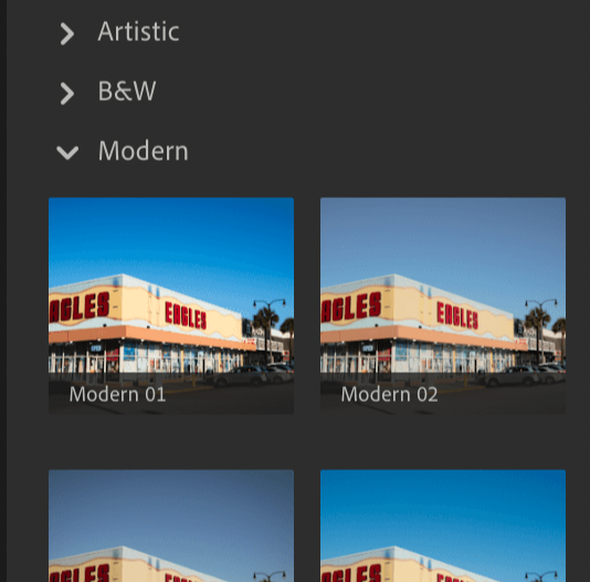
Adobe Lightroom’s built-in color profiles
If you're new to color profiles, start here.
Lightroom has a solid set of free profiles in the Profile Browser under the Creative category.
Just getting comfortable with the profile-first workflow using these is worth doing before you spend money on something else
Third-party profile packs
If you want a more specific look or aesthetic, third-party packs built around .xmp color profiles give you a lot more creative range.
Look for packs that are built profile-first rather than preset-only.
Here are two options I like a lot:
Both are on the pricey side, in my opinion, but I have tested RNI’s profiles and enjoyed using them. I have no direct experience with FilmicLab, but they have received positive reviews from organic sources like Reddit, where you can be certain users don’t pull any punches.
Build your own
It's possible to create custom color profiles if you have software capable of building and exporting LUTs as .xmp profiles. It's a huge time investment, and you'll need to be comfortable in a dedicated color grading tool to do it well, but if you're already deep in that world, it's certainly worth exploring.
My Offering: The Color Kit
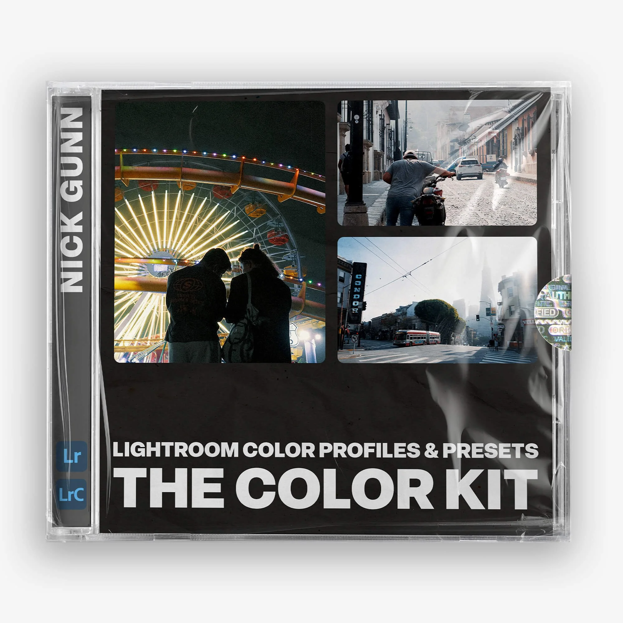
More accurately described as "LUTs for your photos", this look creation tool kit is much more than a Lightroom preset pack.
6 Unique .xmp color profiles inspired by timeless cinema looks
16 Lightroom presets - including +/- variations meant to emulate adjusting your camera's exposure compensation
Compatible ONLY with Lightroom & Lightroom Classic
Honed through 1000s of real-world images and tested by working photographers
If you've used Lightroom presets, you'll know that... they mostly look terrible.
That's because everyone captures and processes their images differently. Unique cameras, sensors, lenses, locations, lighting conditions, and techniques.
This product uses handcrafted .xmp color profiles that fundamentally change the look and feel of your image BEFORE you start making adjustments in Lightroom.
As a result, the color profiles do the heavy lifting, and presets simply create a launchpad for you to nudge your final image in whatever direction you need.
This gives you functional, foundational looks for your images + flexibility to suit your specific editing process, instead of trying (and probably failing) to create a one-click experience.
If you want a budget-friendly starting point that goes beyond Adobe’s built-in options, The Color Kit is the editing tool I built for my own photography workflow.
It leverages 6 color profiles, each inspired by a different cinematic/film-inspired look, and 16 presets designed to work on top of them (but totally optional, as the profiles can be used independently).
It's the result of over a year of personal use followed by months of iterative testing across thousands of images. The goal was simply to build a tool that's flexible enough to hold up in a real workflow, not just look good in a product listing.
If it sounds like something that might work for you, it's available in my shop.
If not, the alternatives above and the workflow below will still make your editing much smoother, regardless of which profiles you use.
How to Use Color Profiles in Lightroom
Start with a well-exposed raw file
Color profiles are designed to work with raw files. JPGs can work, but YMMV. You lose a significant amount of flexibility. Nail your exposure in-camera whenever you can, and compose photographs that are compelling before you open them in Lightroom.
Profiles (and presets, for that matter) enhance a good image, not rescue a bad one.
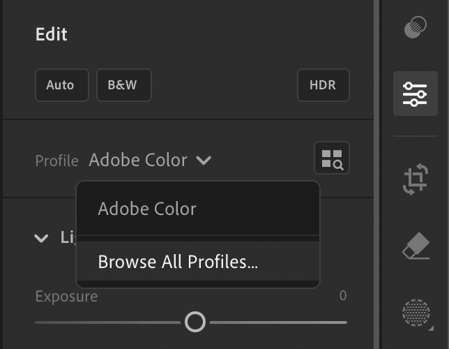
Open the Profile Browser
Look for the Profile Browser at the top of the main ‘Edit’ panel.
This is where your color profiles live.
Browse through them and find one that works with your image. You're not looking for a finished edit, just a foundation. Pay attention to how the colors shift in light and dark areas, what happens to the blues, the greens, the reds, etc.
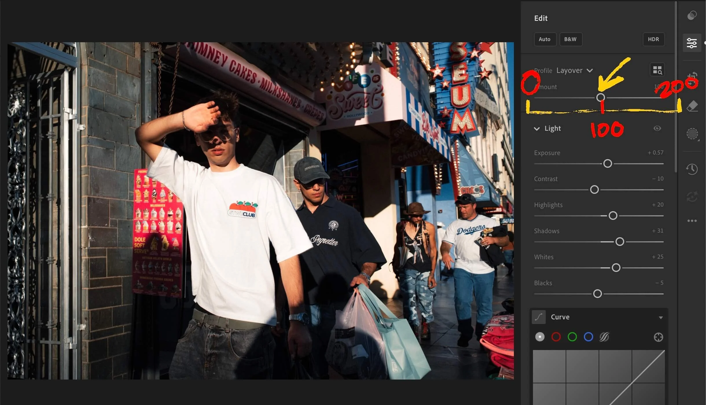
You can also adjust the “strength” of the color profile from 0 to 200, with 100 being the default.
Adjust from there
The profile does the heavy lifting. Your adjustments should be mainly relegated to white balance, highlights, shadows, local edits, masking, grain, etc.
The whole workflow should feel more natural and intuitive because the color foundation is already working underneath everything.
I almost never touch any of the color settings anymore unless there is something very specific I want to correct or change. But 90% of the time, I stand aside while the profile does the “color grading” for me.
A Note on Batch Editing
One of the underrated benefits of the profile-first workflow is how much it improves batch editing. It removes a lot of the tedium of tweaking for consistency.
Apply your chosen profile across your images first, then make global tweaks. Because the profile creates a consistent color foundation, batch editing is far more reliable than with standard presets.
I find my images will hold together as a set more quickly and with fewer adjustments. Even across varying lighting conditions.
The Bottom Line
Presets aren't inherently bad, but if you've been frustrated that they never quite look right on your images, it's probably not you. They're working against the fundamental differences between every camera, photographer, and image they’re being applied to.
Color profiles can fix many of the underlying problems, but even they aren’t a perfect solution.
Remember the other important piece of the puzzle: Taking tons and tons of images, getting better, trying things, testing different workflows, and finding what works for YOU, not some guy on the internet who made a video or wrote a blog.
As usual, thanks for the support & talk soon.
Questions? Hate comments? Feel free to weigh in below or get in touch on socials.